
Instructions and design
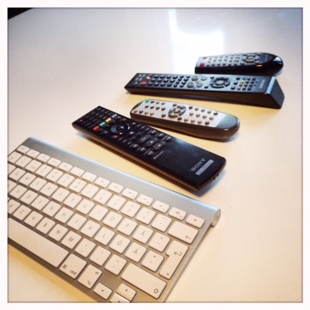
To watch TV at my house now a days calls for a hefty piece of instructions. Just to watch TV. We have multiple controls and they all do different things to different devices. And often it is not the big obvious buttons you need to press to access the different channels. It’s the small button called “source”. We have an Apple TV and use the wireless keyboard to interact with it and when my parents are here to babysit we just tell them to ask our 6-yearold or 3-yearold how to put it on because trying to explain it to my parents would just take long enough time that they would forget what we first started out explaining. There are just too many steps and options. (The keyboard in it self is however great for searching on for example YouTube on the Apple TV, and interacting with it is simple once you have tried. My experience is that the learnability is very good on Apple products .) It is the combination of all these different controls that are the problem when trying to explain how to operate them.
There is no mystery to this as watching TV 20-30 years ago was very much straight forward. Press “On” on the TV and select a channel. And the reason for it being so complex today probably has to do that we have a lot more equipment for the new technologies involved in watching Netflix from your Apple TV, movies from the PS3, TV from the satellite receiver or playing on your Wii. They are all different manufactures probably and have no interest in any cooperation. It’s a free market.
I started playing a game on my iPhone the other day called Limbo. It’s one of many that start out without giving you any instructions what so ever. And it seems to work fine anyway. Now why is that? Some of it probably has to do with good design. Good design seems to need no or very little instructions. But also that it builds on already acquired knowledge, expecting the user to know the basic forms of interaction from previously encountered similar games. But also that if you fail at one step you get to do it over and over again until you get it. The discovery of how to solve a challenge is part of the game.
If we design on what the user already knows instead of trying to reinvent the wheel there is much to win. If more companies standardized interaction they could probably save a bundle on instructions and manuals, by cooperating. The goal should be to design to support intuitive interaction. That, to me, is user centered design.
Then there are the inherited knowledge that does not make much sense, like the Windows “Start” button. I was told it was named “Start” because it started a program. Made no sense, however, to press the “Start” button to close down Windows even if from a programmers point of view you “start” the program that ends Windows from running. It took a while to re-design that button into the button we now know today as the “Windows” button on the bottom left hand corner. Re-designing it without confusing the users to it’s whereabouts, who got used to pressing the “Start” button when closing down Windows without asking any question of the logic in this. That is how we get stuck with bad interaction.
